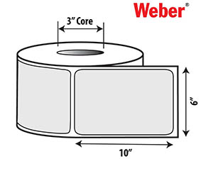
6.00 x 10.0 Custom-Printed Craft Beer Labels
White BOPP Film with Matte Overlaminate

|
Carton Qty.
|
Roll Qty.
|
Labels |
Price/Label
|
Total Price
|
|
1
|
2
|
1000
|
0.2950 |
$295.00
|
|
2
|
4
|
2000
|
0.2180 |
$436.00
|
|
3
|
6
|
3000
|
0.1930 |
$579.00
|
|
4
|
8
|
4000
|
0.1800 |
$720.00
|
|
5
|
10
|
5000
|
0.1730 |
$865.00
|
Order your Taproom Craft Beer Crowler Can Labels with the features that you want. We print these labels on one of our HP Indigo digital label presses that guarantee vibrant colors and incredible detail.
These 6.00" x 10.00" labels are printed on our white BOPP pressure-sensitive film label material with a matte overlaminate for durability and water-resistance protection. Labels come in rolls of 500 only; order per carton (2 rolls). Discounts increase dramatically per carton ordered.
> Get free craft beer label samples of this material to see what your labels will look like.
 Our in-house design team can help you design your labels or you can use this link to upload your design files. Click the Technical Specs tab above for more information on file types and requirements. Design services are available for $100.00/hour. PDF proofs will be emailed for approval.
When we receive an order, our label engineering team will double-check the specifications of your order and contact you if there are any issues. We want to guarantee that your label will look awesome and function correctly. Minimum label order = 1000 labels.
We are a Mac-based work group. If your label files are created on a PC, they must be saved in a ac-compatible file format. Acceptable files include Adobe Illustrator CS6, Adobe InDesign CS5, Adobe Photoshop CS5.1 (with layers), Adobe Acrobat Hi-Res PDF with Illustrator editing capabilities, and Freehand files saved as editable eps files. If a specific part number will be used for the label, please include on the Art File Legend
The following Formats are NOT acceptable as Artwork: PowerPoint, Coreldraw, and Microsoft Word.
Fonts/Type
Please be sure to send all fonts used in your document.
Printer and PostScript fonts both are necessary for us to output your
files correctly. Avoid TrueType fonts. Minimum type size is 4 pt. For
serif typefaces, we recommend 6 pt. as a minimum. Avoid light type fonts
and serif fonts that are very thin, especially when used in
reversed-out areas.
Avoid type placed in Photoshop–
it tends to be jagged, blurry and rough, and will print that way. Never stylize type in the program as this creates problems when the file is ripped to our processor when producing plates. The processor may not be
able to convert to the stylized look. Use the appropriate font (i.e. use the italic version of the font for italicized words).
Art/Photos/Graphic Images
Please include all original files and links in their original programs (specified above). Avoid embedded art in your label artwork. Photos should be scanned at a minimum of 300 dpi at final scale. Crop your photos so that they are placed on or near 100% at their largest usage. Weber can scan your original artwork or photo for you.
Image Area/Die Strike
Maintain a 1/16" clear margin from the dieline (keep in mind the corner radius, too). Include Corner Radius dimension as part of the Art File. Indicate zone or unvarnished areas. Contact your customer service representative for a listing of available die shapes and sizes. Custom dies can also be created for your specific needs.
Color Specifications
Please specify required PMS numbers on spot color artwork. Remember that colors incorrectly named, RGB, or indicated to be CMYK may cause confusion and result in your label printing in an unwanted manner.
Please name your colors appropriately (if white prints as a color on your job, make a spot color called "Prints as white" and clearly indicate where white should print). Be sure to have only the colors that print on the label in your file. Avoid reverse type in areas with more than one color. If it is necessary to use a reverse, the type should have a holding line (outline) to ensure clean letters.
Screens/Tints/Gradients
Screens may range from 100% to a minimum of 1%. Keep in mind that ending a screen or gradients inside the die strike (on the label) can create an unwanted, noticeable hard line.
Lines/Rules
Minimum line width is .4 pt. Reverse lines or rules have a minimum of .75 pt to avoid closing up when printed. Screened rules should be at least 1 pt. to avoid a wavy appearance. Rules should never have a fill
color; only use a stroke/line color.
Bar Codes/UPCs
Indicate the type of bar code needed and position on the label. We can create the bar code for you. The standard UPC A bar code should be at least 80% (preferably 85%) with a height of no less than 3/8".
Bleeds
All bleeds should be 1/16" beyond the die line or crop marks.
|